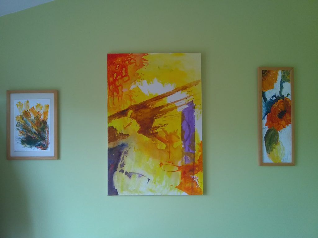
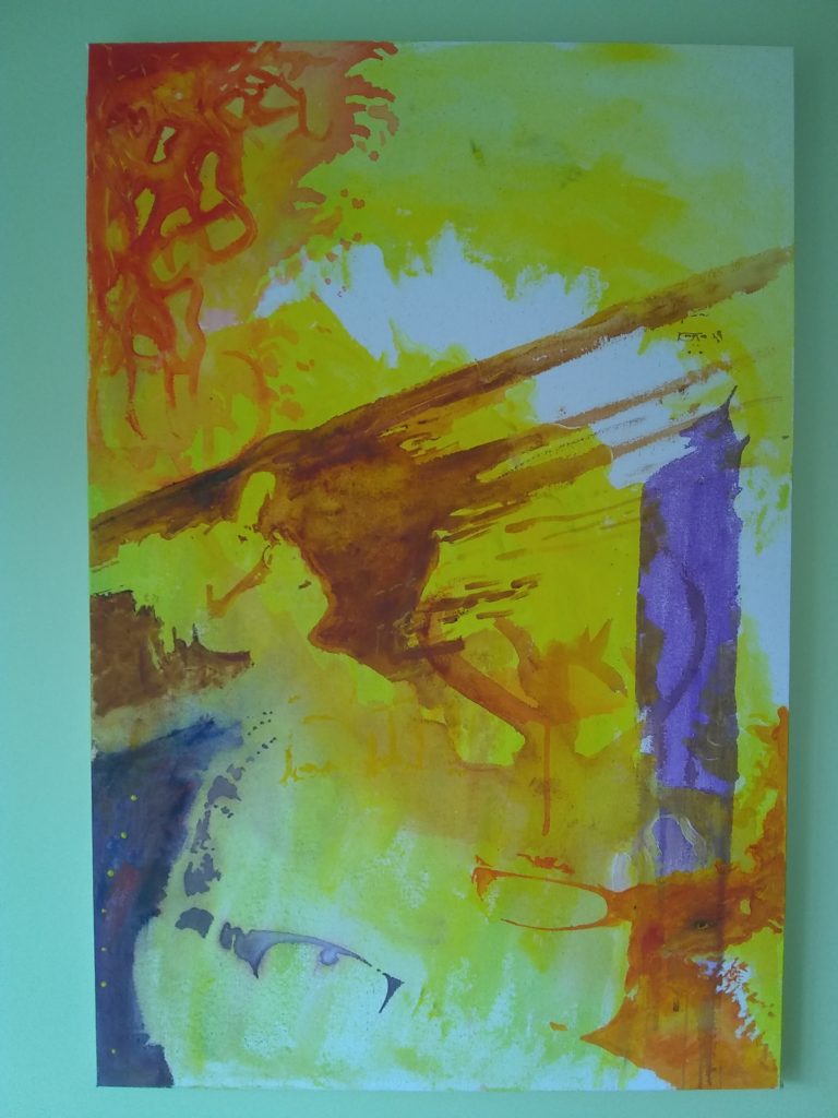
It was my partner-in-crime’s birthday recently, and since it was her Big Lockdown Birthday I decided to try my hand at something different – a great big portrait. But what pose should I use? Is there some way I can do this without her finding out? So I went trawling up in the loft and, I’m going to date myself here, I found our ancient actual-film-in-the-camera photos of ridiculous drunken nights and holidays and lazy Sundays from the early 2000’s, including the very first picture of us together, added in with our more recent landmarks, and assembled the best of them into a loosely cubist collage.
Category: Images
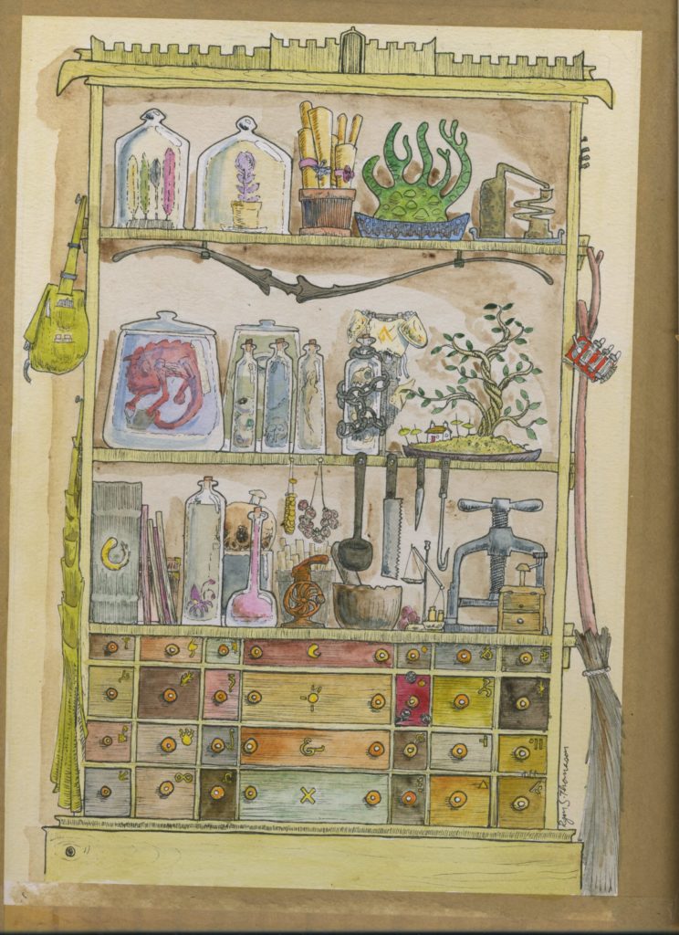
Apothecary’s cabinet
Lino printing tips.
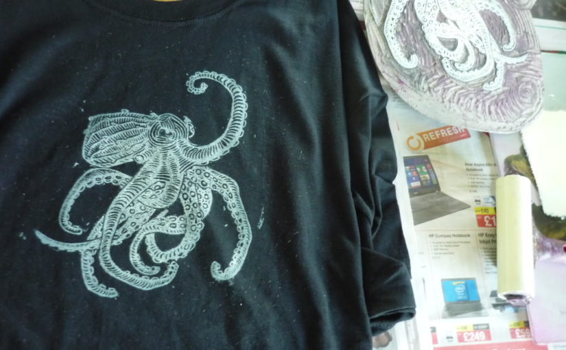
I’ve been making lino cuts on and off for twelve years now – it’s a very satisfying medium, as the results of your drawing, cutting and inking all come out in one big reveal. Here’s some tips on what I’ve found are the most effective ways to turn out good prints at home.
Lots of people swear by heating your lino – maybe the average lino is a little harder than my supply, but if you store it in a warm room, or have a table set up to catch a sunbeam, you should be good to go. If it’s cold inside and the blade is absolutely refusing to dig in, then yes, absolutely, use your oven on the lowest setting. Give it five minutes, and see how you get on. If it gets too warm, it will start tearing instead of cutting and your details will just crumble. Use short, careful strokes, like you’re slowly writing a word, instead of longer ones like you’re using a knife, and you’ll be much less likely to slip. Always make sure your fingers aren’t in front of the blade!
A toughened glass chopping board is my surface of choice for rolling out ink.
Your printing material will make a big difference as to how your prints will come out (I am writing about oil-based inks here). Cotton t-shirts are by far the easiest surface to ink onto, as their soft, slightly fuzzy surface grips the ink amazingly well. As a rule, softer papers like newsprint or printer paper take ink much more dependably than artist’s papers, which tend to slide around a heartbreaking amount when hand-pressing. My advice for paper prints is to try and find a local college or print studio that has a relief press and will let you use it, as it is just about impossible to get clean prints on thick paper if all you have to press with is a big spoon. That same spoon, or a big book, are all you need for printing on fabric though – for the most consistent results, I use a wool felt mat as a base, with a newspaper cover, as this lets the lino and the printing surface join together evenly. Some people advise glueing your lino to a plywood sheet, but unless the sheet and your table are exactly flat you’ll get spots that just won’t print evenly.
Clean-up is important. For oil-based inks, stay away from white spirit – the best solvent is cooking oil. Use cotton rags, because paper towels mush up and fill in all your glorious fine details you slaved over. Have some extra newspaper on hand, and make some quick newspaper prints to soak up the extra ink – wipe off your lino and get the excess off your roller too, it means there’s much less scrubbing to do.
Lastly: drying. If you have a sunny, windless day, go right ahead and hang your prints outside to speed things up. Otherwise, leave them in the warmest, most out-of-the-way spot you can find – if you’re in a mad hurry, some very careful ovening will do the trick.
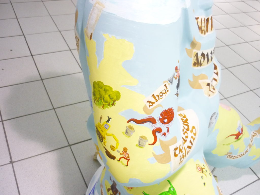
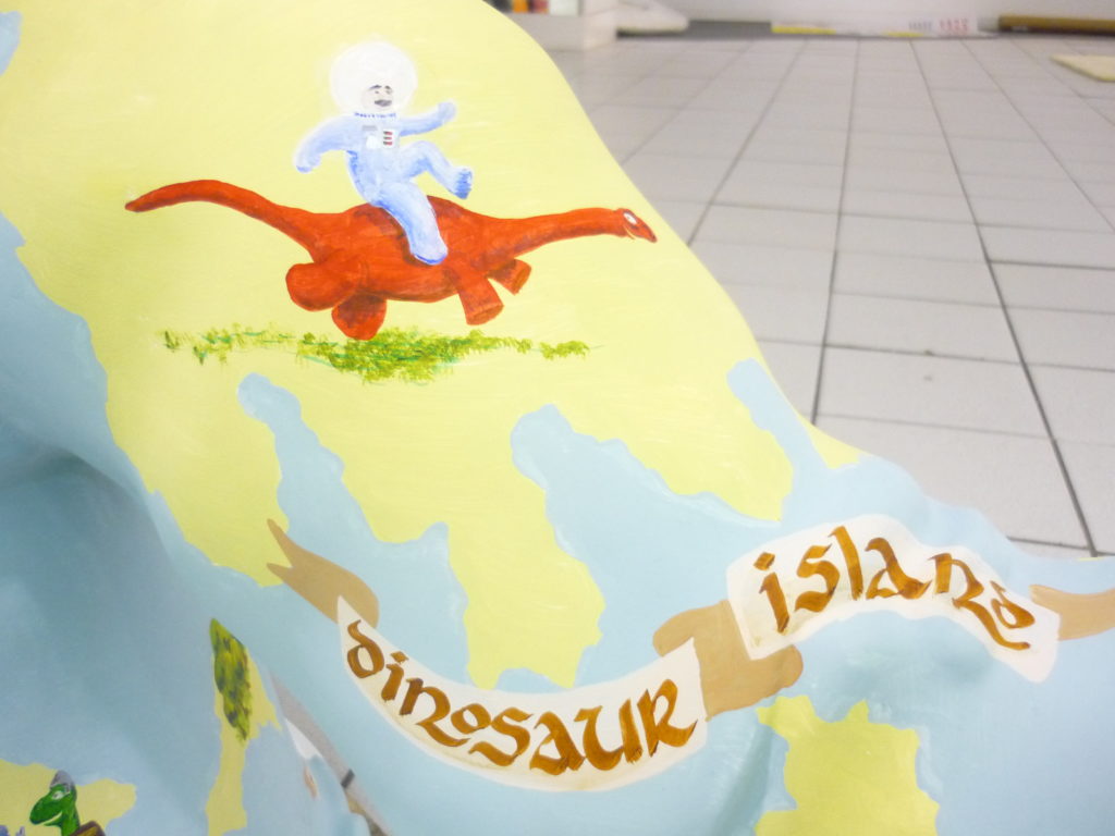
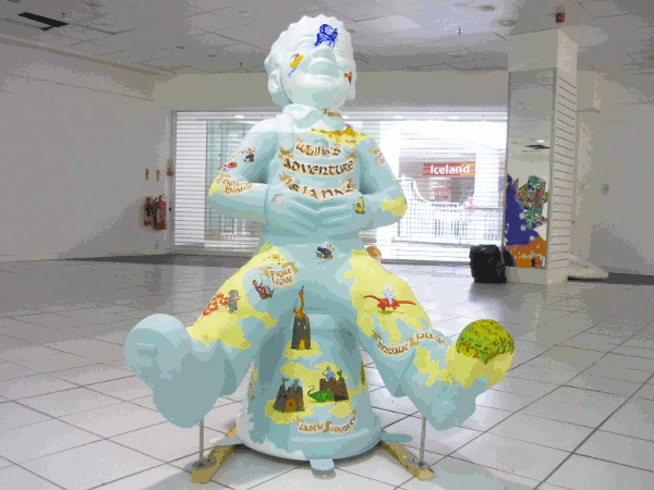
Bucket Trail
I was invited to take part in the Oor Wullie Big Bucket Trail for Glasgow Children’s Hospital this year, with my Adventure Islands design. This will be on show at Glasgow Airport till September 13th, so stop by and have a look if you’re passing through. Ace!
Duncan of Jordanstone Degree Show 2019
It’s Local Degree Show time again! I spent a good Saturday afternoon looking around, with the one bad point being that the Illustration kids were too hungover to open their shop table. Anyways, my favourite dozen, in no particular order, were:
Cecile Bec combined illustration and sculpture, such that her whole show formed one giant composition.
Joanna Migut used a tightly restricted colour palette to great effect.
Eleanor Begg used enormously energetic lines in her paintings, with vibrant colour splashes
Catherine Paterson was my favourite in sculpture – an interactive show encouraging people to make rubbings of her brass and laser-carved wood wildlife images. It looked like it had been enormously popular on opening night as well.
Courtney Szabo had one of my favourite shows – intense, spontaneous movement, massive energy and great colour contrasts all over the place.
Hannah Benassi was another stand-out show, with subdued tones layering into some remarkable compositions.
Sam Renson left me utterly confounded and entranced – giant painted seascapes that look like distorted aerial photographs on crumpled paper.
Kirstie Behrens had some beautifully crafted near-abstract landscape prints on show.
Maia Aitken had some wonderfully expressively alien compositions, with careful colour work.
Lucia Pearla was another highlight, with highly detailed abstracts giving the impression of cityscapes, dominated by almost-legible letter forms shouting into the illuminated dark.
Maike Herrmann was one of several shows in Textile Design that caught my eye. Amazing multi-layered prints, with great depth and complexity.
Katie Scott, likewise, had enormous vitality and playfulness in her work, with a great interactive board for kids to add to her designs.
Molly Marshaley completes the set of vibrant, joyous textiles, with geometric shapes abraded and worn into textures.
Aimee Coulshed finishes my list, with sublime landscapes created in fabric.
That’s fourteen, but don’t make me choose.
Going to town
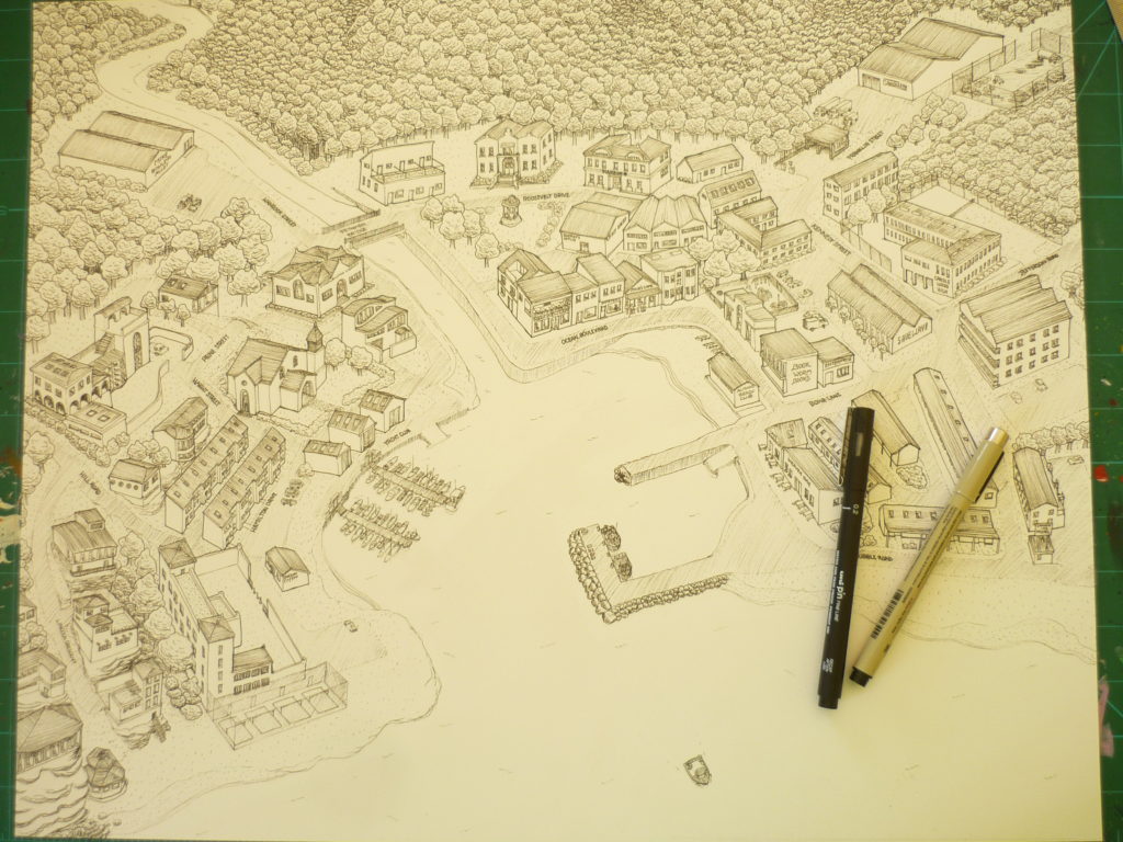
What’s enough trees? This is enough trees.
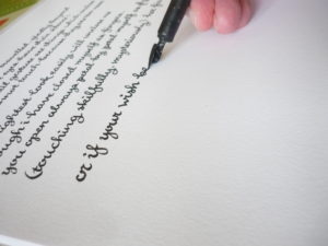
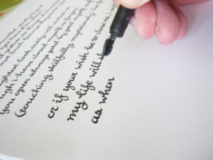
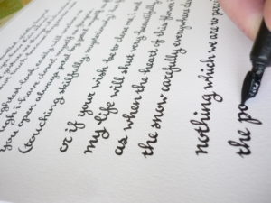
Calligraphising
You’re looking great, did you have a good summer? Mine has been pretty busy, with some very ace projects that I will hopefully remember to post here in the next while, and I’m working on some big new portfolio pieces which will appear here as soon as they’re done. My other big plan for the next few months is getting back to my plan to make ‘calligraphising’ a legit verb for what I do with my days, because ‘I writ it up all nice and purdy’ is a bit of a mouthful. Meanwhile, here’s me busily calligraphising some ee cummings:
Catch you later!
Duncan of Jordanstone Degree Show 2018
So it was my local neighbourhood art college degree show last week, and amongst the usual suspects were the good, the bad and the eye-burstingly beautiful. I’ve picked the dozen artists who most caught my eye, so here we go:
Isla Valentine Wade was my real stand-out, using playful and experimental techniques to make enormous, fascinating, expressionist art in confident colours. A joy to find.
Zoe Webster is one of a set of this years’ artists looking closely at Scottish geography, in this case how it interacts and intersects with the people living around it. Great linework, and powerful use of charcoal.
Camassia Bruce is another artist looking at her environment, in this case the cross-over between OS maps and the terrain they cover. Her exhibition space was mocked up in the style of a study office, so that her work was presented as working maps to be consulted and studied rather than as art.
Heather McNab is the third wandering artist, creating art based on time spent at mountain-tops, and conveying the physicality of these locations.
Lara Orman, by contrast, makes what seem like abstract landscapes, based on unpopulated or unused spaces.
Lisa Healey used the process of printmaking to explore mental health issues, most notably using objects meant for repeated use to make repetitive marks. Art as, and about, therapy and self-help – one of the most powerful exhibitors this year.
Emma Claire Fallon creates deconstructed portraits and huge crowds of tiny stick people, asking what we see in crowded spaces.
Johanna Tonner made wonderfully cross-pollinated art, combining a flurry of techniques to examine femininity and mental health by way of photography, printmaking and soft sculpture.
Amy Tong made wonderful multi-layered illustrations drawing on East Asian pop culture.
Michael Doherty had a series of beautifully observed, well-coloured oil portraits, while the last of my dozen, Zen O’Conor created glowing, genuinely inner-lit skin tones in portraits and surreal pieces that owe more than a little to Dali and Lovecraft.
Honourable mentions: Li Huang‘s painted hands, Tina Scopa‘s giant plant art, and Jo Hanning‘s self-referential sculpture-paintings, some of which involved painting her own degree show as it happened on the opening night. How that turned out in practice is something I wish I’d seen.
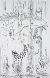
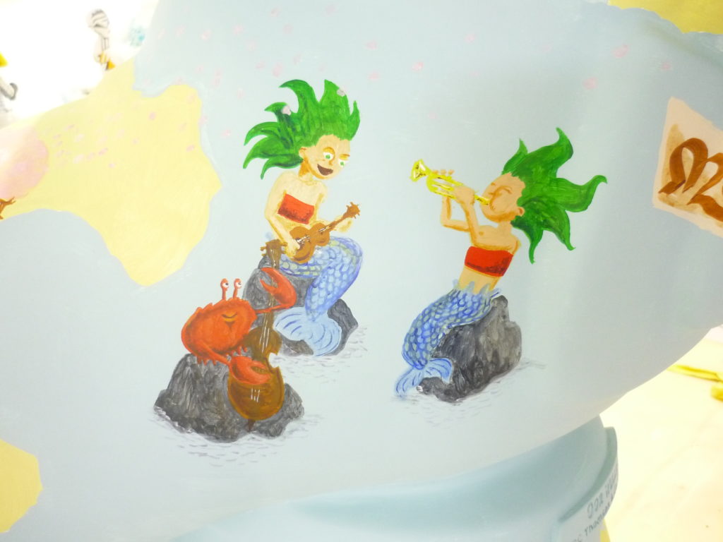
Deep Sea
I’ve always been fascinated by the deep sea, and I’ve nearly always lived in sight of the sea. I love to stand at the shore, my feet at the edge of the water, and think about how from there it’s a straight line all the way to Greenland or Norway or Canada, or a curved line to any damn place. And on the way to that place, what do you pass? Every creature in the sunlit ocean, every thing that swims and crawls and floats and chases and runs and sits and waits, going about their business almost entirely out of sight of people. And you go deeper, out of sight of the sun, and it’s not even a mile away but the rules change entirely, pressure and dark creating entirely alien environments that still fill the usual needs of completely unusual things.
And then there’s the door.